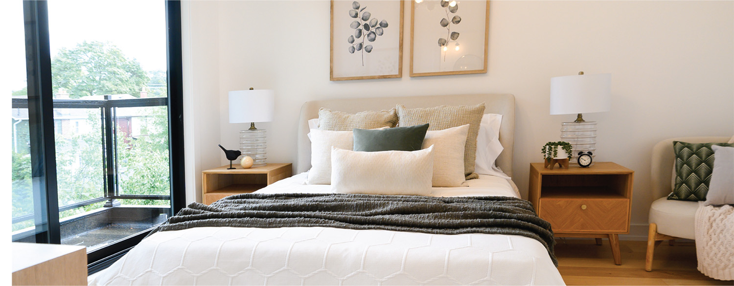
For years, builder beige has been giving neutrals a bad rep. Far from bland, beige, grey, taupe, cream, black and white, can elevate, brighten and even modernize a space. So before you decide on that wallpaper print, hear us out:
1. Neutrals are timeless
There’s a reason every new build comes with white or beige walls. Timeless neutral colour schemes never feel dated or off-trend. Pink velvet couches, green formica tables, even that yellow wingback chair – all were fun for awhile, but neutrals are what we circle back to. And unlike those other fads, they never need an explanation.
2. Neutrals are a blank canvas
Neutrals are literally neutral. They don’t have an intrinsic mood or vibe, and they can be used to push a space into endless possibilities. Want to add some coziness? Creating cozy spaces with beige is as easy as adding in soft textures and low furniture. Feeling playful? Look for neutral prints or accents with unusual shapes.
The biggest benefits of neutrals colours in interior design is that they never feel too busy, never clash and will always be easy to mix and match.
3. Neutrals give you space to grow
Neutral interiors for modern homes give you the opportunity to introduce modern trends, and replace them when they feel stale, without much time, money or work. Add jewel tone cushions to a large grey couch for winter, then replace them with pastel prints for spring. That white wall is the perfect backdrop for your vertical plant hangings, but will also showcase your artwork if you turn out to have a black thumb.
Neutrals are the workhorse of design, and we want to give them their due. Let us help you use them right to create a space that works with you now and in the future.


